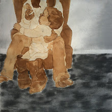
Untitled, 2009, charcoal and conte on paper
This one was close to catastrophe a couple times, and it did need one emergency alteration. All mostly because of my rusty techniques. I am becoming more and more comfortable with the end result. This is dramatically different than what I had planned but it may be better this way. It is more yellow in this photo than in natural light due to the lighting I set up. iPhoto can only go so far to fix it. Anyway, blah, blah, blah. I'm probably being too critical since my first critique in 2.5 years is tomorrow afternoon. Regardless, I'm pretty sure that I'll eventually forget the struggle I had with this piece and simply enjoy it for what it is. It'll grow on me. I'm glad that I don't indulge on the impulse to tear into shreds artwork that isn't going well. I just wouldn't let myself give up on this thing. Things went better once I put the Tool CD in. I'll just start with that next time.


I thought this looked really good! And the blog makes your charcoal background look almost green- which gives it a cool texture.
ReplyDeleteThanks! Its nice to hear that. I should have qualified my statement about my cross contour drawings. There is one that I'm pleased with and this is it. I agree about how the blog background changes how the charcoal looks. It adds an interesting warmth to the piece that I didn't expect. Chalk one up for happy accidents! When your looking at the actual drawing you don't get that. Its quite stark actually. However the weight of the paper adds a carpet-like texture. Somewhat of a Berber feel. I love thick paper.
ReplyDeleteThe ones I'm ashamed of are not on my blog.